Northern Economist 2.0

Wednesday 21 June 2023

Recent Employment Growth in Ontario: A Snapshot

 When it comes to employment growth, the Canadian and Ontario economies are still growing relatively robustly despite nearly a year of Bank rate increases that aim to cool off the economy and inflation.  The accompanying figure presents the percent change in total employment (monthly data, three-month moving average, not seasonally adjusted) across Ontario and its main economic regions over two recent time periods: May 2022 to May 2023 (over one year) and January 2023 to May 2023 (the last five months).  The results suggest overall robust growth but with some major differences across the province.


Year over year (May 2022 to May 2023), employment in Ontario as a whole has grown nearly 2 percent with the period from January 2023 to May 2023 growing at just below 1.5 percent.  Year over year growth was highest in Windsor-Sarnia (9 percent) followed by the Kitchener-Waterloo-Barrie area (7 percent), Muskoka-Kawartha (5 percent) and then the Northwest (4 percent).  Toronto and Ottawa also saw growth year over year at about 2 percent respectively.  The latter two account for most of the job creation in Ontario despite the lower growth rate because well over half of Ontario employment is in these two cities.  

What does stand out in these employment growth numbers is that some parts of Ontario are not doing as well as others.  Kingston-Pembroke, Hamilton-Niagara, London and Northeastern Ontario have seen employment decline both year-over-year and since January of this year.  While Windsor is up significantly year-over-year, it turns out that 2023 has seen much slower growth.  Stratford-Bruce is down year-over-year but there has been growth in 2023.  Then there is Northwestern Ontario which appears to be in the midst of a relatively strong employment surge.  

So, overall Ontario is still booming.  Over the period 2006 to 2023, average annual monthly employment growth has been approximately 1.2 percent so growth rates in the 1.5 to 2 percent range mean Ontario as a whole is still doing exceptionally well.  True, these growth rates are down from the immediate rebound of the post pandemic era but overall since May of 2022 Ontario has added 144,000 jobs which averages to about 12,000 jobs a month - well above historical performance.  On average, since 2006 Ontario has added about 7500 jobs a month.  As for the regions exhibiting slowdowns in employment creation, they are in many respects areas where longer-term economic and employment growth has consistently been a challenge with the exception of the Northwest which seems to be seeing a robust uptick rooted in forestry, mining and tourism as well as public sector construction.

So, with the first half of 2023 nearly done, it appears Ontario overall is in good shape.

Thursday 1 June 2023

Ontario's Net Debt: A Long Term Overview


With all the focus on the US debt ceiling political debate, it is sometimes easy to lose focus on our own debt situation at both the federal and provincial levels.  Taking a long-term view on Ontario’s net public debt of course requires data and as part of my ongoing efforts on putting together Ontario’s fiscal history, I have been able to get Ontario’s provincial government net public debt back to 1914.  The data comes from two sources.  First, there are the more recent numbers going from 1966 to the present which are obtainable from Finances of the Nation and the Ontario Financing Authority.  As for the pre-1966 numbers, there are a number of provincial budgets from the early and mid-1960s which among other things contain a lot of historical data on revenues, expenditures, deficits and debt.

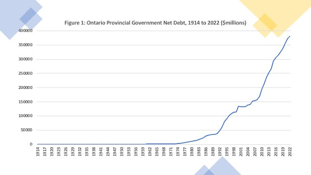
Ontario from 1867 and into the early 20th century generally ran surpluses largely due to the bountiful natural resource revenues from forestry and mining rents and royalties.  The acquisition of large amounts of capital debt appear to coincide with northern Ontario infrastructure development of the early 20th century – in particular the advent of the Temiskaming and Northern Ontario railroad circa 1902. Further expansions of debt occur during and after World War I with the advent of the motor care and provincial highways as well as the expansion of the hydroelectric grid.  And of course, there is the Great Depression which played havoc with public finances.   Ontario’s net debt numbers begin in 1914 (See figure 1) at just over 6 million dollars and by1945 had reached 480 million dollars.  Between 1945 and 1960, Ontario’s net debt grows to 994 million and in 1961 Ontario’s net debt tops one billion dollars.  By 1980, Ontario’s net debt had reached nearly 11 billion dollars and grew to just over 35 billion by 1990.  It is the period since 1990 that sees an even more rapid expansion of nominal net debt growing to 134 billion dollars by 2000, 194 billion dollars in 2010 and then about 380 billion dollars by 2022.  Over 90 percent of Ontario’s net public debt has been acquired since 1990.


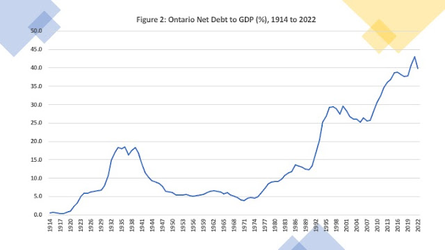
Of course, nominal numbers alone are not sufficient as it is the size of the debt relative to the economy - the net debt to GDP ratio – that matters more.  Figure 2 illustrates this quite nicely.  The Great Depression era sees a first peak of the Ontario net debt to GDP ratio in the 15 to 20 percent range.  It then falls and levels off at about 5 percent going into the 1970s.  After that it begins an overall rise with particularly steep jumps during periods of recession – in particular, the early 1990s, and the era of the Great Recession/Financial Crisis 2007 to 2010.  As a result of fairly generous federal transfer support, the pandemic did not see as large a spike in Ontario’s net debt to GDP ratio as these other two periods.  


In the end, while the size of the provincial debt in nominal terms seems to shake a lot of people, it is debt relative to the size of the economy that should generate greater concern.  The Great Depression Era aside, Ontario generally had a net debt to GDP ratio at about five percent up
until the 1970s.  The period since the 1970s represents a period where the ratio has generally trended upwards.  If one defines fiscal sustainability as a stable or declining net debt to GDP ratio, then the period before 1970 can be seen as one where Ontario’s revenue and expenditure structure was generally fiscally sustainable.  One cannot say the same with respect to the period since 1970.  And yet, it would appear that despite occasional fits of rhetoric, Ontario has not been stirred to action when it comes to its net debt.


Thursday 18 May 2023

Post Pandemic Business Recovery: Some Are Doing Better Than Others

The COVID-19 pandemic  had a devastating effect on Canada’s business sector and new data is emerging that helps illustrate the size of the drop in business activity as well as the subsequent recovery.  Figure 1 uses data from Statistics Canada (Table 33-10-0270-01 Experimental estimates for business openings and closures for Canada, provinces and territories, census metropolitan areas, seasonally adjusted) to generate an index of active businesses for four Ontario cities as well as the province of Ontario.  It sets January of 2016 equal to 100.  For example if in January of 2016 you had 1200 active business and in January of 2023 you had 1500, then January of 2016 would be equal to 100 and January of 2023 would be 125.  Everyone starts at 100 in order to generate comparisons that would not be easy to see if the absolute number of business are used.  For example as of January 2023 Thunder Bay had 2,832 active business while Toronto had 192,016 which would not yield terribly useful visuals if plotted together.  


The chart is for Ontario and four cities: Thunder Bay, Greater Sudbury, Toronto and Hamilton.  With the exception of Thunder Bay and Sudbury, there was growth in the number of active businesses from 2016 to 2020 and then a dramatic drop which affected everyone.  From January to May 2020 there was 14.6 percent drop in the number of active Ontario businesses.  Toronto saw a drop of 15.8 percent followed by Hamilton at 13.4 percent, then Thunder Bay at 11.5 percent and Sudbury at 10.3 percent.  A recovery then begins but Thunder Bay and Sudbury unlike Ontario as a whole or Hamilton or Toronto barely match their pre-pandemic number of active businesses by 2023.  Indeed, if one looks at the entire 2016 to 2023 period(See Figure 2), Thunder Bay sees a decline of 3.8 percent while Sudbury is down one one-tenth of one percent.  Relative to 2016, the number of active businesses is up 8.6 percent in Toronto, 9.3 percent in Hamilton and 7.9 percent in Ontario as a whole.  


Pandemic impact aside, Thunder Bay and Sudbury seem to be suffering from a longer term set of problems with business activity given that they were experiencing a decline prior to the pandemic.  Between January 2016 and December 2019, Thunder Bay saw 124 fewer active business while Sudbury saw 40 fewer business.  After the pandemic drop, both of these cities recovered but only to approximately where they were prior to the pandemic.  Over the longer term, business formation has been weak and represents a serious economic challenge.


Wednesday 17 May 2023

Is Ontario's Rising Cost of Living Really That Bad?

The news currently is full of stories about the rising cost of living whether it is grocery prices, rents, housing or energy.  The release of April’s CPI inflation rate shows it nudging upwards once again to 4.4 percent raising the spectre of further interest rate increases down the road.  Apparently one fifth of Canadians feel they are completely out of money as inflation “bites.” And along with the usual afflictions on budgets, inflation is apparently also taking a toll on entrepreneurial mental health. Needless to say, those of us of a certain vintage who remember the double digit inflation and interest rates of the early 1980s sometimes wonder if part of what is going on here needs to be interpreted within the context of life experience.  That is, if you are in your 30s and 40s, what is currently underway is an extreme price shock whereas if you are in your 50s and 60s the current inflationary and cost of living surge is relatively modest.


What does the evidence say?  Well, the accompanying figure plots a number of times series starting from 1990 using Ontario data.  For all of them, it sets 1990 as the base year and equal to 100 thus allowing us to see how what the increases  have been for all the series in a standardized way.  The data for rents for Toronto and Ontario is from CMHC, the CPI and nominal GDP per capita from Statistics Canada and the Ontario minimum wage you can get online from an assortment of sources. As the figure shows, the cost of living in Ontario has gone up since 1990.


For example, since 1990 the average rent for a Toronto two-bedroom apartment has gone from $689 to $1811 per month -a 163 percent increase.  Needless to say, being an average it masks the fact that at the margin, someone looking for a two bedroom in Toronto right now will likely face rents of over 3,000 a month if not more. For Ontario as a whole, average rents have gone up similarly from $576 to $1511. At the same time, the going market rate for a new rental ranges widely across Ontario also with two-bedrooms going for $3,290 in Toronto to $2,262 in Hamilton to $2,050 in Kingston - all above the “average” for all rented units.


With respect to the average rents, the increases in the accompanying figure are spread out over thirty years and while higher than the increase in the CPI, they matches pretty closely to the rise in nominal per capita GDP which has risen 167 percent.  Of course, one often sees the argument that the working poor cannot keep up but the Ontario minimum wage from 1990 to 2023 has gone up 206 percent – faster than average rents (162 percent), inflation (103 percent) or per capita GDP (167 percent).


So, what is the problem?  I think the problem is the rapidity of the recent increases relative to the resources available to pay.  From 1990 to 2010, the average rent for a two-bedroom in Toronto rose 63 percent or an average of 3 percent annually.  Over the same period, average rents in Ontario rose 61 percent (or just under 3 percent annually) and the CPI rose 48 percent (about 2.3 percent annually).  Meanwhile, hourly minimum wages rose almost 90 percent (4.5 percent annually) (on average) while per capita GDP rose almost 80 percent (4 percent annually).  This suggests that resources  were able to keep up with rising prices.


For the 2010 to 2022 period, the average rent for a Toronto two bedroom rose 58 percent (about 4.9 percent annual average) with the Ontario average also at 4.9 percent annually.  As well, the CPI rose 31 percent (at 2.6  percent annually on average). However, much of the "pulling up" of the average has occurred since 2019 – the pandemic era.  Meanwhile, since 2010, the minimum wage has grown 51 percent (at 4.3 percent annually) while nominal per capita GDP rose 45 percent (annual growth at 3.8 percent).  All of this is notwithstanding the reality that if you have been renting the same place for the last 15 years and are rent controlled, your experience is different from someone who needs to find a new rental right now. 


Ultimately, the period from 1990 to 2010 in Ontario was all things given a relatively more prosperous period than 2010 to 2023.  What seems to have happened is that in general the public over the period 1990 to 2010 experienced low interest rates, relatively low inflation and fairly robust economic growth which translated into a relatively easier time of making ends meet than the period since 2010.  The period since 2010 started with low interest rates but are now seeing higher interest rates, higher inflation and lower GDP growth.  For anyone born after 1980, the current experience is undiscovered country.  Needless to say, there are a lot of unhappy campers.  So, the crux of the matter seems to be that there has been a surge in cost but not accompanied by the economic productivity that would afford a greater ability to pay.  For those at the lower end of the income distribution, the average annual increases in the minimum wage have on average been higher than the increase in nominal per capita GDP but that is little comfort if you need to find a new place to live at current market rents. 


Friday 5 May 2023

The Rise and Fall of Ontario's Relative Income


As part of my work on Ontario’s fiscal history since Confederation, I have also been putting together long-term series on Ontario output and population.  Such information is useful given Ontario’s historic role as Canada’s largest economy and key industrial powerhouse.  Much of this data is now available at Finances of the Nation which has Ontario nominal GDP back to 1926 as well as population back to 1867 and CPI (for Canada back to 1867).


The larger issue is how to estimate GDP for Ontario prior to 1926.   However, given that Canadian GDP is available back to 1867, using Ontario’s average share of Canadian GDP from 1926 to 1950, one can apply that estimate (0.445) to Canada’s GDP from 1867 to 1925 (also available at FON) and obtain an estimate.  This is not that unreasonable an approach given that past studies have suggested that at the dawn of Confederation, Ontario’s per capita incomes were already nearly 60 percent above Nova Scotia and New Brunswick and 25 percent higher than Quebec.


In terms of Gross Value Added as estimated by Alan Green (Regional Inequality, Structural Change, and Economic Growth in Canada. 1890-1956, Econ. Dev & Cult. Change, 1969) in 1890 Ontario’s economy was 49 percent of the Canadian economy while by 1910 it was at 41 percent and by 1929 it was 39 percent which averages out to 43 percent.  So, the Alan Green numbers are used to estimate Ontario’s GDP for the 1867 to 1925 period using 49 percent to 1890 and 43 percent to 1925. It is important to note that these are estimates and far from perfect, but they nevertheless tell a long-term story.


Ontario’s per capita GDP is plotted alongside the rest of Canada’s (ROC) real per capita GDP in Figure 1.  In 1867, Ontario’s real per capita GDP in $2020 was $3,428 compared to $2,768 for the rest of Canada – a 24 percent difference.  By 2022, Ontario’s real per capita GDP has grown to $66,600 and the ROC’s to $67,258 – practically the same.  What happens in between is a period of per capita income divergence till approximately the eve of the Second World War and then a period of convergence – with a fair amount of fluctuation.  


Figure 2 plots the ratio of Ontario’s real per capita GDP to the ROC’s.  There is a brief period during the wheat boom Prairie settlement era from about the early 1890s to about 1902 when Ontario per capita incomes fall relative to the rest of Canada, but this coincides with both the recession of the early 1890s and the scaling down of the Green Adjustment factor from 0.49 to 0.43 and may be a statistical artifact.  The Ontario per capita income advantage generally rises during the leadup to World War I and continues to rise afterwards peaking in the 1930s.  It then falls as the rest of the country economically develops and grows and by the first decade of the 21st century, Ontario real per capita GDP is pretty close to the average of the rest of the country.  On average, for the entire period 1867 to 2022, Ontario's real per capita GDP has been about 30 percent higher than the rest of Canada. The average since 2000 has only been 7 percent.


Ontario’s early economic advantage and dominance fueled by the economic protectionism of the national policies enabled it to grow its per capita income relative to the rest of the country.  With the economic development and diversification of the post-World War II period and the growth of western resource-based economies, the per capita income difference has fallen.  In many respects, this process of long-term convergence can be viewed as a long-term Canadian economic success story that has seen a muting of regional economic differences  There are of course still regional economic differences in terms of per capita incomes across Canada’s provinces and Ontario is still Canada’s largest economy and one of its wealthiest provinces, but it is not the cash cow you might think it is when it comes to per capita incomes at the moment. 


Monday 1 May 2023

Population Growth and Property Taxes in Ontario’s Top 30


The last decade has been marked by rapid population growth in Ontario with total population rising from 12.852 million to 15.109 million - nearly 18 percent growth.  This growth has largely been in urban areas and some municipalities have grown substantially faster than others.  Figure 1 presents population growth rates from 2011 to 2022 for Ontario’s thirty largest municipalities.  These municipalities range from 2.928 million for Toronto to just under 100,000 for Niagara Falls and their population total in 2022 was 10.645 million people or about 70 percent of Ontario’s total population. Population growth rates ranged from a high of 69 percent for Milton followed by 34 percent for Brampton, and 32 percent for Waterloo.  At the bottom of the list were Mississauga, Thunder Bay, and Chatham-Kent.  Of these 30 communities, about half grew faster than Ontario as a whole while the remainder grew more slowly.  


Now the determinants of municipal population growth are complex but largely revolve around socio-economic incentives of one type or another including general economic opportunities and employment, access to locational amenities and services, the ability to provide housing via both availability and affordability and municipal taxation.  Taxation is an intriguing variable at the municipal level because on the one hand one would expect higher property tax levels all other things given to discourage population inflows and reduce population growth.  On the other hand, rapid economic growth and population growth expands municipal tax base and allows for lower rates on a broader base and hence lower average property taxes paid – residential, commercial, and industrial.  Needless to say, the resolution of the effect of property taxes on population growth is ultimately an empirical question and a fairly complicated estimation process that would need to account for this bi-directional effect.  


Nevertheless, it does not hurt to look at some charts.  Figure 2 presents the percentage change in average detached residential bungalow taxes (Source: BMA Municipal Reports and several municipal websites) for the period 2011 to 2022 for Ontario’s 30 largest municipalities ranked from highest to lowest.  The largest increase appears to be for Richmond Hill which saw average property taxes essentially double.  It should be noted that Richmond Hill was in the bottom third of these 30 Ontario municipalities when it came to population growth.  There is then a steep drop off going to 53 percent for Markham  and then a gentler downward slope ending with Windsor at 19 percent.  


In terms of the relationship between residential property taxes and population growth, there are two more figures.  Figure 3 looks at population growth from 2011 to 2022 as a function of the average bungalow taxes in place at the start of the period – taxes in 2011.  This does not control for anything else but does suggest a slightly negative relationship.  That is, places with higher property taxes in 2011 saw slower population growth in the decade afterwards.  Figure 4 looks at the relationship somewhat differently plotting population growth against the percentage change in average property taxes paid by a bungalow and here the relationship is slightly negative.  However, if you dropped the two obvious outliers in this chart (Richmond Hill and Milton), you get a more negative linear relationship between population growth (vertical axis) and property tax growth (horizontal axis) (see Figure 5).


So, the long and short.  Do higher property taxes affect population growth in a negative way?  Probably, but the relationship is only one of many factors that affect population growth.

Tuesday 21 March 2023

Ontario Budgets: The Long View


As we get ready for Ontario Budget Day, its always fun to look at the long-term picture to see where Ontario has been.  And by long-term, I mean the entire period in which Ontario has been a province of Canada – 1867 to 2022.  Figure 1 uses data from historic Ontario Budgets for the and from the Finances of the Nation fiscal and macroeconomic database to construct and plot real per capita Ontario government revenues and expenditures in 2020 dollars for the period 1867 to 2022.  Real per capita revenues have grown from about $40 per person in the 1870s to reach over 10,000 dollars today.  Expenditures have followed a similar pattern.  Much of the growth in per capita spending has occurred since the mid 1960s with the expansion of public health care as well as education spending.  From 1868 to 1965, real per capita expenditures grew from $22 to $1468 and since then has grown to reach $11,470.  Indeed, the implied annual growth rate of real per capita spending over this entire period works out to about 4 percent.


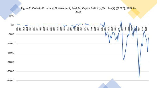
Figure 2 weighs in with a long-term picture of fiscal balance – deficits and surpluses.  Needless-to-say, a better measure would be a deficit to GDP ratio but Ontario GDP pre-1960 is more difficult to acquire though one day constructing estimates going back to 1867 is possible.  Over the entire 155-year period covered by this data, there has been a deficit in 87 years – 56 percent of the time.  Deficits were less common prior to 1945 with deficits only 46 percent of the time whereas since 1946 there has been a deficit two-thirds of the time.  However, the post-World War II period can be divided into two periods – one of consistent surpluses and one of consistent deficits.  The longest consecutive run of surpluses in Ontario history is from 1941 to 1967. In the period since 1967, Ontario has run a deficit 93 percent of the time. 


And there you have it. Happy Budget Day.

Friday 17 March 2023

Ontario's Spring Budget Approaches


Ontario will be announcing its 2023-24 budget on March 23rd in the wake of its third quarter fiscal update in February which reported a $6.5 billion deficit for 2022-23, an improvement over the Fall Update which had the deficit pegged at nearly $12 billion.  It would appear that fiscal circumstances are shifting rapidly as the Ontario economy appears to continue to exhibit robust growth resulting in revenues rising more than expected.  Indeed, revenues in 2022-23 are projected to be $16.6 billion higher than forecast in the 2022 budget and $9.6 billion higher than was projected in the Fall 2022 update.  Meanwhile, expenditure growth appears to be somewhat more restrained.  Compared to what was projected in the 2022 budget, 2022-23 is only up $3.3 billion. Even in the case of health spending – a contentious area given shortages and waiting lists – the province’s financial Accountability Office has noted that going forward, the province appears to be allocating billions of dollars less than what is required.


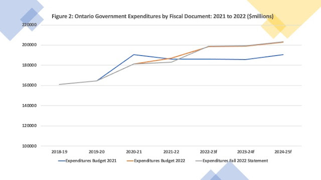
Indeed, a glance at some charts shows that these shifting projections go back even further to the 2021 budget that came as the pandemic recovery began in earnest.  Figures 1 and 2 plot revenues and expenditures as laid out by fiscal documents starting with the 2021 budget, the 2022 budget and the fall 2022 economic and fiscal update.  Both expenditures and revenues have shifted upwards with subsequent budgets and updates, but the shifts are more dramatic for revenues than expenditures.  Compared to revenues in 2019-20 of $156 billion, for 2022-23, the 2021 budget forecast $160 billion, the 2022 budget forecast $180 billion and the Fall 2022 update forecast nearly 187 billion to which the third Quarter update has now brought us to $196 billion.  Despite the pandemic and fears of deflation and revenue collapse, revenues today are $40 billion higher than 2019-20 – an increase of 26 percent.    


As for expenditures, from $165 billion in 2019-20, for 2022-23, the 2021 budget forecast $186 billion, the 2022 budget forecast nearly $199 billion and the Fall 2022 update a few hundred million more but still rounding out to $199 billion.  We are now looking at expenditures based on the third quarter update of nearly $202 billion.  Since 2019-20, expenditures have grown by $37 billion – an increase of just over 22 percent.  


What comes next over the course of fiscal year 2023-24 hinges on how the economy performs.  If we assume inflation coming down to 4 percent and real GDP growth of 2 percent, that still brings us to nominal GDP growth of 6 percent.  While 6 percent nominal growth is down from the nominal growth rates in 2022 and 2023, there is no reason to believe it will crash given the overall robustness of the Canadian and Ontario economies despite increases in interest rates. Historically, a one percent increase in the province’s nominal GDP is correlated with a greater than one percent increase in total revenue meaning that one can probably expect total provincial government revenues to rise by over 6 percent this year bringing revenues up easily another $15 billion.  With a deficit for 2023-23 now being projected as per the third quarter finances at $6.5 billion, it would not be a surprise if it comes in even lower and 2023-24 actually presents us with a hefty surplus.

Friday 10 March 2023

Ontario's Chronic Health Spending Shortfalls


This week’s Ontario health news featured a report by the province’s  Financial Accountability Office that the challenges facing Ontario’s health system were “expected to persist” as a result of under funding and accompanying shortages of health workers. The FAO projected total health sector spending for Ontario and compared it to the Ontario government's projections and found that between 2022-23 and 2027-28, a significant gap opens up between what the government is projecting and what the FAO expects spending to be.  The cumulative shortfall over this period will be about $21 billion which over a seven year period averages out to about $3 billion a year.


The FAO projections were for total government health spending but one suspects that if one takes Ontario’s robust population growth into account, the future shortfalls are probably more serious.  Indeed, per person provincial government health spending going into the pandemic was essentially flat  as Figure 1 shows.  


 It turns out that spending shortfalls have been a feature of Ontario health spending for some time when one compares what is actually being spent to what simple models of health spending determinants predict should be spent.  


Generally speaking, models of health spending determinants consider the main drivers of health spending to be income (usually measured by GDP) and aging (usually measured by the proportion of population over 65 years). Fun fact: In Ontario, the proportion of population aged over 65 was 8 percent in 1965 and in 2022 stands at just over 18 percent.  Table 1 uses data from the Canadian Institute for Health Information National Health Expenditure database as well as data from Statistics Canada to present  a simple regression of the determinants of real per capita Ontario provincial government health spending. Real per capita provincial government health spending (in 2021 dollars) from 1971 to 2022 is regressed on real per capita GDP as well as real per capita federal cash transfers (health, social, equalization) – which is really a source of provincial government income.  As well, there is included the percent of the population aged 65 to 79, the percentage of the population aged 80 years and over, and a dummy variable to capture the impact of the COVID spending surge. The results are estimated with STATA using OLS .  


Both per capita GDP and per capita transfers are both positive drivers of provincial government spending.  A one dollar increase in real per capita federal cash transfers supports about 50 cents in real per capita provincial health spending while a 1 dollar increase in real per capita GDP is associated in a 3-cent increase.  The results also suggest that relative to the population aged below 65 years, the real aging driver of spending is the proportion aged over 80 years.  The percentage aged 65 to 79 seems to be negatively associated with real per capita provincial government spending.  Put another way, there may be a healthy survivor effect in that if you make it to 65, you are likely to be in relatively good shape until you approach 80 when the costs of aging quickly escalate.  And, these results implicitly suggest that the proportion under age 65 is a bigger driver of spending that popular belief thinks it is.


The coefficients in this regression can be used to generate predicted Ontario government health spending based on the determinants and then compared to actual spending.  These results are plotted in Figure 2.  In the immediate wake of the Great recession – between 2010 and 2012, actual real per capita government health spending in Ontario exceeded what the economic determinants predicted it should be.  However, from 2012 to the onset of the pandemic, not only was inflation adjusted Ontario government health spending per person flat, but it was below what the model predicts it should have been.  For example, in 2016, Ontario spent $150 per person less on provincial government health spending - about 3 percent less per capita. When the per capita numbers are aggregated to population totals, the numbers are in the billions.  On average over the period 2012 to 2019, Ontario spent an average of 1.1 billion dollars less than what the model predicts. Some years, this shortfall was as high as 2.5 billion dollars. And, with the pandemic winding down in 2022, it appears the shortfall has reemerged with spending $2.1 billion below what it should be. 


 While it has long been known that per capita government health spending in Ontario is below that of the other provinces, it is also lower than what Ontario's own economic and social health spending drivers predict it should be. 

Saturday 4 March 2023

Blue Ribbons and Ontario Universities


Ontario has made a number of announcements regarding its post-secondary education sector.  First, it extended its tuition freeze for a third year.  As you might recall, going into the pandemic, Ontario reduced domestic student tuition fees by ten percent and since then has held them frozen meaning that after three years of time and inflation, in real terms tuition has been reduced by at least twenty percent.  Though not emphasized this week, Ontario’s government grants to its universities also remain largely frozen.  As a result, with flat domestic enrollment and frozen funding, at the margin, Ontario university revenues have only been growing because they have been recruiting international students making them increasingly reliant on what could be a volatile source of revenue.


However, the provincial government is concerned enough about the future sustainability of its universities that it has also announced a Blue Ribbon Panel to “provide advice and recommendations to the Minister of Colleges and Universities to help keep the post-secondary education sector financially strong and focused on providing the best student experience possible. ” A blue ribbon panel or committee is generally a group of “exceptional” and “accomplished” people who are brought together to study a particularly vexing problem and bring their expertise to bear on providing solutions.  It is several notches below a Royal Commission but designed to bring a semblance of non-partisan expert advice to a problem.  This panel is expected to report back in summer of 2023.


Now it has already been remarked that there are no faculty representatives on this Blue Ribbon Panel.  However, it would be churlish to say the least to infer that the provincial government in any way thinks that university or college faculty are neither exceptional or accomplished.  In trying to choose faculty representatives for such a committee, one opens a can of worms larger than the universe.  If the provincial government had selected someone from the humanities, professional schools and sciences would have complained they were being neglected.  If a scientist, the humanities would have been outraged. If they chose a faculty member from a large university, the small universities would have complained.  If they had picked an economist, there would have been a chorus of criticism charging that the outcome was predetermined by selecting a minion of the capitalist neoconservative hegemony. You get the picture.


So in the end, the government chose a panel from people that it sees as leaders without a direct current stake in universities to study the problem.  There are no faculty nor do  there appear to be any currently serving university administrators on the panel either, though they all have links to post-secondary education in one form or another as well as board and community experience.   There is a member with student experience.  And there is past faculty and administrative experience in the case of Bonnie Patterson and Alan Harrison – who incidentally is also an economist who was at McMaster teaching at the time I was there in the 1980s.  There does seem to be an emphasis on CEO types with some financial experience and also strong representation from the new age of e-learning and other types of perceived innovative practices in education with CEOs from E-Campus Ontario and Contact North.


So, what will the panel decide? Well, that is to be decided obviously though I suspect e-learning and micro-credentials is one direction they are likely to emphasize. That will not please some universities who are trying to bring everyone back to the before times with full in person learning and on campus presences including night classes.  However, this is motivated as much for pedagogical reasons as it is for financial ones rooted in the need to fill parking lots, residences, and cafeterias with paying customers.  


The crux of the problem is that the provincial government thinks universities should be training people and providing marketable skills and is not happy where the money seems to be going.  Parents and students think that universities are supposed to provide the ticket to a career and lifestyle and do not seem to think the tuition fees worth what they are getting – though they still insist their kids go to university.  Essentially, the provincial government and the public do not perceive they are getting value for money especially given what appear to outsiders to be high paying cushy jobs for university faculty and staff. 


Meanwhile, university faculty believe they are independent researchers and scholars, building minds, and extending the frontiers of knowledge while university administrators seem to be conflicted players of whack-a-mole - negotiating the competing demands of government, parents and students, donors, and faculty and staff.  As the old university adage about where the money should go goes, faculty like new faculty hires, Deans like new programs, while University Presidents like new buildings.  So, the interim solution by government has been a grant and tuition freeze which universities have got around by bringing in more international students who can be charged as much as the market will bear.


Needless to say, this is not a scenario for long-term sustainability.  Demographics suggest that domestic enrollment in Ontario has peaked and will remain flat for some time to come.  Thus, without an increase in tuition fees, domestic students will not lead to increased revenues.  Moreover, domestic students want a flexibility in their learning environments – i.e., online learning – that seems to be at odds with the preferences of many university administrators and faculty.  Bringing in more international students is also not a stable long-term solution given that at any time that tap could shut.  And then there is the question that if the Ontario public university system is something Ontario does not want to pay more for either via public funds or private (more tuition) and is increasingly geared to international students, then why should it be as large as it is?


This last question is the uncomfortable one but needs to be asked given the increasing financial stress Ontario universities are facing especially in the shadow of the Laurentian bankruptcy.  Does Ontario have too many public universities given domestic demand? That is a question the Blue Ribbon Panel will inevitably have to answer.  Perhaps there should be mergers and rationalizations culminating in several province wide campuses – A University of Southwestern Ontario, A University of Eastern Ontario, a University of Northern Ontario and then a half dozen or so fully comprehensive research universities?  Should some universities be merged with community colleges to create Polytechnics?  Should there be a provincial E-University to satisfy the demand for flexible credentials earned online?  But then what of the rest of the system?


In the wake of the Laurentian debacle, the provincial government has nevertheless been creating new small financially weaker universities left right and center so it appears they are not too concerned that there may be too many universities.  Moreover, all communities with their own current university campuses will scream if their university is no longer a “real” university or does not offer the range of programs they are used to having.  Just don’t ask them to pay for it.  The political cost of major change is high and as a result there is unlikely to be any major change. 


My guess, is that along with keeping all the current players in Ontario’s university system, the end game is going to be the creation of assorted new online learning options independent of the current system and perhaps even new targeted private micro-universities that will provide the programs the provincial governments thinks should be offered.  This is in keeping with the provincial government policy towards its post-secondary sector of the last thirty years that has allowed colleges to evolve into perceived lower cost universities and universities expand their physical footprints without much thought as to what might happen down the road. 


Some of this is already underway and what the Blue Ribbon Panel may offer is some way of moving forward in a transitioning post-pandemic university environment that is still moving towards an unknown equilibrium.  At minimum, it will provide a justification for what the government wants to do. On the other hand, the panel may surprise everyone – including the government - with their recommendations which is why governments do not necessarily follow what Blue Ribbon Panels or Royal Commissions for that matter, suggest they do.


Tuesday 21 February 2023

Police Month Continues! Police Spending in Ontario Municipalities


It appears that police month is continuing here on Northern Economist as I came across police spending data from the latest BMA Municipal Report  - the 2022 edition.  The BMA reports provides estimates of net policing costs per capita both excluding and including capital cost amortization as well as per $100,000 dollars of assessment.  These costs vary quite a bit and the BMA report has a preamble to the police cost data explaining that such costs can vary a great deal depending on the daily inflow and outflow of non-residents and commuters, the policing of specialized facilities in a municipality such as casinos or airports as well as demographic characteristics, the urban rural mix, service levels and the complexity of crimes. 


Having noted all that, Figure 1 provides a chart ranking policing costs per capita for Ontario’s thirty largest municipalities and they range from a high of $461 per capita for Thunder Bay to a low of 258 dollars per capita for Milton, Burlington and Oakville, which of course all share the costs via the Halton Regional Police Service. Indeed, a number of these other communities have the same per capita net costs because they are part of a regional service – Durham Region (Clarington, Ajax, Whitby, Oshawa, Pickering), York Region (Vaughan, Richmond Hill, Markham, Waterloo Region (Kitchener, Waterloo, Cambridge), Niagara Region (St. Catharines, Niagara Falls).  


In trying to find out what might account for these differences, the simplest starting point is a plot of net per capita costs against the number of officers per 100,000 population as provided in Figure 2.  It is a positive relationship with each additional officer per 100,000 resulting in an addition of nearly 2 dollars per capita in policing costs.  These are policing costs and are not simply the cost of an officer but include all the costs and support associated with that officer.  As you will recall in an earlier post, police forces also have a fairly large number of civilian employees as support.  However, simply stating that having more officers is going to cost more money is not terribly helpful in trying to explain differences across municipalities. 


Figure 3 plots the net costs per capita against the area of the municipality in square kilometers.  For most of these police forces, as area rises, the per capita cost actually falls though it starts to rise for very large municipal areas.   The plot vaguely resembles a u-shaped cost curve but it is ultimately not very satisfying chart because there is not really much in the middle to support the fitted curve.  The three communities on the far right who make up the upward sloping part of the curve are Hamilton, Ottawa and Greater Sudbury.


Figure 4 looks at the relationship between policing costs per capita and the community crime severity (Using the 2021 Crime Severity Index from Statistics Canada).  Once the polynomial curve is fitted to these points, one can say with a certain degree of confidence that there is an positive relationship between crime severity and police costs per capita but it is somewhat non-linear with one peak at a crime index of 50 and another at about 90.  Why this relationship might be bi-modal is either statistical luck of the draw with this data set or the subject of future research.


Finally, Figure 5 plots police costs per capita against total population to see if there are any economy of scale type relationship that might emerge.  The u-shaped curve that emerges is misleading because only Toronto is responsible for pulling up that curve,  For the rest of the communities, as population rises, per capita policing costs come down.  In a sense, throwing Toronto into the mix is not useful because it is so much larger than any other municipality in Ontario. 


I guess, the ultimate insight would be to run a regression with some of these variables as determinants of per capita policing costs.  Table 1 below presents the results of a very simple regression of net police costs per capita on municipal area (square kilometers), total population, Crime Severity Index in 2021 and regional fixed effects variables with the GTA/Central as the omitted comparison category.  Policing costs per capita do appear to be significant and positively related at the 5 percent level with Crime Severity and being in northern Ontario.  Population also seems to be a positive driver but again that is likely being driven by Toronto.  Still, it could be that really large populations create much more complex crime environments that really drive up police costs per capita.


So, in the end, what drives police costs in Ontario? Crime Severity is likely a factor but regional differences as captured by regional dummy variables also seems to be of some importance.  Obviously, more research is needed on this topic but that is time intensive and assumes that someone actually wants an answer.