Thursday, 31 May 2018

Canadian Economy Slows in First Quarter 2018

Well, the Statistics Canada GDP numbers are out for the first quarter of 2018 and real GDP in the first quarter of 2018 grew at 0.3 percent which down from 0.4 percent the previous quarter.  Indeed a quick glance at a chart with the quarterly growth rates going back to 2013 suggests the period of more robust growth that took place in 2016 and somewhat into 2017 is winding up perhaps explaining the reluctance of the bank of Canada to raise interest rates yesterday. More to the point, expressed at an annualized rate, real GDP was up 1.3% in the first quarter. In comparison, real GDP in the United States grew 2.2%.

Real Gross Domestic Product Growth (Source: Statistics Canada)


combined line chart&8211;Chart1, from first quarter 2013 to first quarter 2018


The slower growth was driven by by a deceleration in household spending, lower exports of non-energy products and a decline in housing investment (-1.9%).   The impact of changing household spending is indeed a factor in the slowdown and may be tied to the recent increase in interest rates as well as other factors such as the rise in gasoline prices and rents.  According to Statistics Canada: "investment in housing fell 1.9% in the first quarter, the largest decline since the first quarter of 2009, due to a drop in ownership transfer costs (-13.5%). Lower resale activity coincided with new mortgage stress measures introduced nationwide in January...Household final consumption expenditure decelerated for a third consecutive quarter, slowing to 0.3% in the first quarter."

The sustainability of an economy led by consumer spending and housing may finally be coming into question.  How do things look going down the road? Well, FocusEconomics June 2018 Consensus Forecast still has Canada's real GDP growing at 2.2 percent annually this year with a decline to 1.9 percent in 2019 and 1.8 percent in 2020.  Given an annualized growth rate of 1.3 percent in the first quarter of 2018, we have a lot of ground to make up to reach 2.2 percent.The United States meanwhile is projected at 2.8, 2.4 and 2 percent for the same years.  Normally, when the United States does well so do as a result of our exports to them we but that traditional link has been under increasing stress given a more protectionist US economy. Today's news that the United States may be going ahead with tariffs on Canadian aluminum and steel will not help matters much.

Tuesday, 29 May 2018

Northern Ontario Property Tax Update

The 2017 edition of the BMA Municipal Study is out and there is a wealth of material here for blog posts for the next little while.  It is a municipal election year so comparisons of property taxes and service levels are particularly of interest. For this post, an update of property taxes paid for a detached bungalow in the five major northern Ontario cities.  According to the BMA, the definition of a single detached family bungalow is: "A detached three-bedroom single story home with 1.5 bathrooms and a one car garage.  Total area of the house is approximately 1200 sq, ft. and the property is situated on a lot that is approximately 5,500 sq. ft."

Figure 1 plots the average residential property tax paid for a detached bungalow for the five cities for the period 2005 to 2017.  In 2005, these averaged $2,260 and by 2017 the average was $3,530 representing an increase of 56 percent.  While property taxes trend up everywhere  there are several features that caught my interest. First, there is a clustering with Thunder Bay, Timmins and North Bay as higher property tax jurisdictions while Greater Sudbury and Sault Ste. Marie are generally cities with lower property tax levels - at least for this class of property.  In 2017, average taxes for a detached bungalow were highest in Timmins at $4,294, followed by Thunder Bay at $3,695, then North Bay at $3,576 then Greater Sudbury at $3,123 and finally the Sault at $2,954.


Second, the last year has seen the property taxes paid on an average  detached bungalow in Timmins apparently spike while those in North Bay actually declined.  Between 2016 and 2017, the value for Timmins rose from $3,574 to $4,294 - an increase of 14.4 percent.  Meanwhile, in North Bay, there was a decline from $3,632 to $3,576 -  a decline of 1.5 percent.  Naturally, these changes need to be put into the context of the local municipal economic and fiscal environment. 

Keep in mind, this also does not mean every property owner in Timmins saw a 14.4 percent increase in Timmins but the steeper increases may be related to how a change in assessment values for mining companies by MPAC that turned out to be lower than expected was measured in the BMA Report.  The projected decline could have resulted in higher rates on residential properties but the full impact appears to have been mitigated for the time being.   It turns out the average homeowner only saw a $125 increase in 2017 in Timmins.  As for North Bay, there apparently are rate decreases underway as a result of market assessment value shifts.


In any event, the annual percent increases for 2015 to 2017 plus an average of the three years are plotted in Figure 2.  The average increases in property taxes for a detached bungalow were highest in Timmins at 7.2 percent and lowest in North Bay at 0.6 percent.  Thunder Bay was in the middle of the pack at 2.9 percent - just below Sudbury at 3 percent and ahead of the Sault at 2.6 percent. more to follow.

Friday, 25 May 2018

Large Municipal Operating Surpluses Do Not Always Mean You Are Good at Budgeting

The City of Thunder Bay’s final 2017 budget surplus is apparently now double what was originally projected. Whereas a $2.8 million year-end surplus had been forecast in January, it has now apparently grown to $5.6 million dollars.  Note that when the budget was approved last year, there would not have been a projected surplus as at the municipal level projected revenues need to match projected expenditures. 

Moreover, it should be noted that this is not an overall operating surplus but a “tax-supported” surplus meaning that there is a surplus on the tax supported side of municipal expenditures.  This is an important distinction because while it is a “tax reported” surplus, the variance is being reported as a percentage of the total net operating budget (2.3% of $240.1 million) and the total gross operating budget (1.6% of $358.7 million).  Given that municipal tax revenues in 2017 were $183.987 million, the variance can also be reported as a percent share of that which comes out to 3 .04 percent – a much larger number.  Indeed, I would argue that this is the correct variance number.

Thursday, 24 May 2018

Wealth Inequality in the North Atlantic Anglosphere

I have been working on historical wealth and wealth inequality for most of my career and have put together a lot of my thinking and long-term analysis together in one spot - a new book published by Palgrave MacMillan in their Pivot series.  The ebook edition was released several days ago and is available on the Palgrave site.  The hard cover version should be available at the end of June or early July. If you want a short overview of the book, I put together a post for the Palgrave Exploring Economic History Blog that provides a nice summary of the book and some of its main ideas. An excerpt from the blog:

"Before 1750, wealth inequality was higher in the United Kingdom than the United States, but American inequality grew rapidly to match the United Kingdom by mid-nineteenth century. The preindustrial period was marked by lower wealth inequality in both the United States and the United Kingdom. The subsequent era of industrialization is marked in all three Anglosphere countries by rising wealth inequality. Wealth inequality declined in the twentieth century with redistribution away from the top one and ten percent. The decline in wealth inequality halted in the 1970s but with a rebound in American wealth inequality.
For the United Kingdom, the top 1 percent wealth share rose from an average of 25 percent in the pre-1850 period to 64 percent for the 1850 to 1900 period. More remarkably, the average share of wealth held by the top ten percent of the wealth distribution in the second half of the nineteenth century was just over 90 percent in the United Kingdom, approximately 72 percent in the United States and about 56 percent in Canada. By the early 21st century, Canada and the United Kingdom have their top ten percent with approximately 50 percent of wealth and the United States over 70 percent. Meanwhile the top one percent own just under 20 percent in Canada and the United Kingdom while in the United States the share is closer to 35 percent.
The twentieth century mitigation of wealth inequality correlates with several factors: rates of economic growth closer to the rate of return on capital, increased unionization rates, rising public spending on health and education, larger public sectors, increased home ownership rates, the onset of substantial estate taxation, more progressive income tax systems and in the case of the United Kingdom a housing policy that resulted in the disposition and dispersion of much public housing into private hands. A reduction in the strength of unions as measured by unionization rates as well as the end of estate taxation and less progressive income tax systems is associated with more economic inequality since the 1970s especially combined with lower economic growth rates relative to the return to capital."

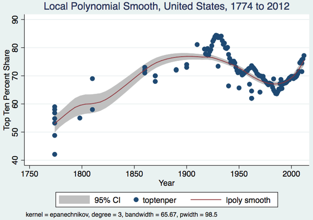
You can also get quite a few bits of the book on Google Books if you want a free preview.   The book surveys the evolution of wealth inequality as measured by the Gini Coefficient and the wealth shares of the top 1% and top 10% for Canada, the United States and the United Kingdom.  A quick sample of one of the figures below on the wealth share of the top 1 percent in the United States from 1774 to 2012.

Anyway, it has been great working with Palgrave MacMillan and its staff in putting this project together and seeing it through.  Am glad to see the book out.

Friday, 18 May 2018

Ontario's Political Future: Yours to Discover


Ontario’s election may very well be decided over the next few days as Ontarians pause to take in the long weekend and use it to step back and ruminate over the political future of the province.  One of the most recent polls reveals that the PCs are poised to form a majority government with 40 percent support.  However, what is also interesting is that over the last little while this poll shows that Liberal support has plummeted to 22 percent while NDP support has soared to 35 percent.  All this suggests that there is still a certain amount of volatility amongst the voters as we head into the home stretch of campaigning into the June 7th election.

So, what do Ontarians want?  On the one hand, the recent policy initiatives of the Ontario Liberals are popular across a large swath of Ontarians especially in the larger urban centers.  Investments in transit and infrastructure, the raising of the minimum wage, rent control, more health spending and a general activist government approach to social and economic policy seem to be what many Ontarians want.  Indeed, these policies are much like those the NDP is advocating and if one combines the Liberal and NDP totals it is obvious that 55 percent of Ontarians seem to want some type of centre-left approach to government and the economy.

It seems that many Ontarians want Liberal-NDP type policies but seem tired of having them implemented by the Liberals and particularly by Premier Wynne.  Kathleen Wynne is undoubtedly the most capable of the three leaders in terms of her handling of issues and her analysis and discussion of policy issues.  Yet, she is also quite driven and intensely focused with a sort of self-absorbed messianic zeal that can be interpreted as exclusionary to alternate opinions. The Liberals have been governing since 2003 and Ontarians who like centre-left policies and would like to see a change in government are likely to shift to the NDP – hence the Andrea Horwath-NDP surge.

As for the PCs, their policy platform has been less clear and it is difficult to see if they really are driven by conservative values and policies or are now simply a change party driven by the personality of their leader.  Doug Ford has a much larger appeal than urban elites in the Toronto-Ottawa corridor would have expected and his support is also diverse.  However, to date the policies and changes the PCs might bring to government have not been as clearly articulated as those of the other two leaders.  Much of the campaign is really a populist drive for change with a rhetoric directed at the “little guy” to contrast with perceptions of the Liberals as elitist. 

Put another way, you know what you are going to get if the Liberals form the government – more of the same.  If the NDP form the government, it will be essentially the same policies but more so and with a new leader.  In terms of fiscal management, there will be a very elastic budget constraint for years to come from either the Liberals or the NDP.  Yet it should also be noted that, to date none of the three leaders seem particularly concerned about the state of the province’s finances and one does not see the province’s debt abiding anytime under either Wynne, Horwath or Ford.

If the PCs form the government, it is not so clear what you are getting in terms of policy approaches to social and economic policy as well as fiscal management.  One might assume that as PCs, there will be an emphasis on deregulation or more efficient government but this is not clearly apparent to me.  There have been a number of promised tax cut announcements but this is not the same as a coherent tax reform strategy.  Yet, making it clearer might also coalesce support more strongly around one of the two centre-left options.  At this point, the PCs appeal cuts across a wide socio-economic range and perhaps their strategy is to promise change but not get too specific and split the left.

So, what is an Ontarian to do this long weekend as they think about the province’s future?  It should be to think long and hard about the direction of the province in terms what is the coherent big picture vision of the economy and the province’s finances these three main party leaders are offering.  To date, the campaign has focused on disjointed announcements of spending and programs designed to target key ridings or voter demographics. The money to pay for all of this is not a concern.  Ontarians of course deserve much more than this but are unlikely to get it.  All three leaders seem to believe that elections campaigns are not the time to articulate coherent economic and fiscal visions.


Sunday, 13 May 2018

When Will the Trans-Canada Be Completely Four-Laned Across Northern Ontario?

Ontario's provincial election campaign is in full swing and Thunder Bay Liberal party candidates and cabinet ministers announced the Liberal party's northern platform on May 11th. A key highlight of the plan was to completely four-lane the Trans-Canada Highway throughout the province from the Manitoba border to the Quebec border.  As we all know, after years of lobbying going back to the 1980s and early 1990s, four-laning of northern Ontario highways finally commenced and has been underway for a number of years in two key areas - Thunder Bay to Nipigon as well as from Sudbury to Parry Sound.   So, my question is - if we want to completely four-lane the Trans-Canada Highway, how long will it  take to fully four-lane the Trans-Canada in northern Ontario?

So here is a quick back of the envelope estimate.  Let us assume only the "southern" route will be completely four-laned.  This is a 1,628 km stretch (based on Google maps) going from Kenora to Parry sound via Thunder Bay-Nipigon-Marathon-the Sault-Sudbury and Parry Sound.  The stretch from Thunder Bay to Nipigon is about 109 km long with the commitment to four-laning announced in 2009. As of spring 2018, 30.2 km has been completed and another 19.5 km are underway.  Based on the 30.2 km completed to date and a nine year completion date, we are looking at 3.3 km a year.  If we want to be charitable and include the 19.5 km underway, then  we are looking at about 50 km over 9 years or approximately 5.5 km per year as the highway completion rate.

The stretch from Sudbury to Parry Sound - part of the old Highway 69 - is 173 km long (again using Google maps).  The provincial government announced the four-laning of Highway 69 in 2001 and to date 70 km from Parry Sound south to Port Severn have been completed and about 70 km from Parry Sound north to Sudbury is either complete or underway with the aim to be done by 2021.  This still leaves quite  a bit of highway to be started and apparently the remainder is in the engineering and property acquisition phase. So, based on the total of 140 km completed (including Port Severn to Parry Sound) since 2001 with completion scheduled for 2021, this means 140 km over 20 years or 7 km per year.  The pace of northern Ontario highway four-laning is a little faster south of Sudbury.

So, take the total distance of 1,628 km and subtract what is underway or completed and you have  about 1,438 km left to go.  Let's make it a nice 1,400 km left as there already is some four-laned highway near the Sault and Kenora also.  If we average the Thunder Bay-Nipigon and Highway 69 four-laning speeds, we get 6.25 km per year as the pace of highway four-laning in northern Ontario.  At this pace, it will take 224 years to completely four-lane the remainder of the southern route from Kenora to Parry Sound bringing us to the year 2242.   This as many of you should know is about 20 years before the events of Star Trek the original series which is supposed to take place between the years 2265 and 2269.


Needless to say, its going to be a long road, getting from there to here. Saying you are going to need faith of the heart to get there is probably an understatement.


Wednesday, 9 May 2018

Renting in Northern Ontario-You Are Richer Than You Think


When it comes to housing markets, what gets the most attention is the affordability of single detached homes particularly in large urban centres like Toronto and Vancouver.  However, the high price of housing has boiled over into rental markets and it turns out that more Canadians are now renting than ever before.  Over half of the new households formed since 2011 are apparently renting and the greater demand is being reflected in higher rents.

So, what are rents like in the five major northern Ontario cities? Figures 1 and 2 plot the monthly rent for one and two-bedroom apartments in major northern Ontario cities from 1992 to 2017 using data from Statistics Canada.  In 1992, rent for a one-bedroom was the highest in North Bay at $510 monthly and lowest in Timmins at $451 while for a two-bedroom it was highest in Thunder Bay at $620 and lowest in Timmins at $565.  By 2017, monthly rent for a one-bedroom was highest in Sudbury at $848 followed by Thunder Bay at $779. For a two-bedroom in 2017 Sudbury was the highest at $1058 followed again by Thunder Bay at $957.


Over the period 1992 to 2017, the annual average growth rate in rents for a one-bedroom was 2.4 percent in Sudbury, 1.9 percent in Thunder Bay, 1.6 percent in North Bay, 1.8 percent in the Sault and 2.2 percent in Timmins.  Over the same period, for two-bedroom apartments, the average growth rate was 2.4 percent in Sudbury, 1.8 percent in Thunder Bay, 1.9 percent in North Bay, 1.9 percent in the Sault and 2.1 percent in Timmins. Indeed, these increases are pretty close to the inflation rate as measured by the CPI.

The results are informative – rents have gone up in all northern Ontario cities - but the pace of increase picked up after 2004.  The average annual growth rate for one-bedroom apartments in these five cities was 2 percent from 1992 to 2004 and 3 percent from 2004 to 2017. For Greater Sudbury, rent growth was especially pronounced from 2004 to 2017 with an annual average growth rate of 3.5 percent for both one and two-bedrooms.   Thunder Bay in comparison saw average annual growth of 2.5 percent for one-bedrooms and 2.6 percent for two-bedrooms.   However, this period saw Sudbury with a mining boom whereas Thunder Bay experienced the forest sector crisis.

The higher growth rates in rent since 2004 coincide with the run-up in housing prices over the same period.  Even with rent controls, as new tenants come into a rental unit, there is the opportunity to raise the rent to reflect market conditions and the market is getting tighter. As all first year economics students can tell you, the long-term impact of rent control policies is to reduce the stock of units below what they would have been.  As a result, with rising demand, rents have climbed.

However, rents in Thunder Bay and Sudbury are still quite a bit lower than Toronto based on the numbers here.  In 2017, a one-bedroom in Toronto rents out at $1194 – 41 percent more than Sudbury and 53 percent more than Thunder Bay.  A two-bedroom in Toronto in 2017 rents out at $1403 – 33 percent more than Sudbury and 47 percent more than Thunder Bay.  According to the Winter 2018 Conference Board CMA reports, in 2017, household income per capita in Toronto $47,548 compared to $48,742 in Greater Sudbury and $47,287 in Thunder Bay.  Given that average incomes in Toronto are not really that much higher than either Thunder Bay or Sudbury it stands to reason that after paying your rent you will  have a lot more disposable income left over in Thunder Bay and Sudbury relative to Toronto. This really should be getting greater play in the economic marketing of these two cities.

Tuesday, 1 May 2018

Gasoline Prices Are Going Up Again


Gasoline prices are on the rise in North America as a result of rising demand combined with more restrictive supply.  An aspect of tightening supply comes as a result of more "cooperative behavior" between major suppliers Russia and Saudi Arabia which was recently highlighted in a report on NPR.  Vancouver made the news with the highest prices on the continent hitting $1.62 a liter on Monday.  Along with refinery issues in Washington State which supplies a portion of Vancouver's gasoline, part of the high price in Vancouver also is a function of taxes in that Vancouver has very high taxes on motor fuel and a new carbon tax came into effect this month.  

While prices in Canada generally have headed up over time, there is a substantial range between the highest and lowest prices.  The accompanying figure plots the monthly maximum and minimum price of unleaded gasoline at self service stations for 18 major centers as compiled by Statistics Canada over the period January 1990 to March 2018. The cities are:St. John's, Winnipeg, Regina,Saskatoon, Edmonton, Calgary, Vancouver, Victoria, Whitehorse, Yellowknife, Charlottetown, Halifax, Saint John, Quebec, Montreal, Ottawa-Gatineau, Toronto and Thunder Bay.  Needless to say, the trend for gasoline prices over time is upwards (Figure 1).


What is also of interest is what appears to be a growing gap between the trend lines over time.  For example, if you go back to January of 1990, the price per liter of unleaded gas ranged from a low of 47.9 cents in Calgary to a high of 58.9 cents in Yellowknife -  a gap of 11.1 cents.  In March of 2018, the price ranged from a high of 151.4 cents in Vancouver to a low of 106.9 cents in  - a gap of 44.5 cents.  Indeed, if one plots the gap between the highest and lowest prices, one finds that it has grown over time as shown below (Figure 2).  This of course suggests that over time there has been increased dispersion of gasoline prices across cities and regions in Canada.  

However, one needs to standardize for the mean and if one takes the standard deviation of these gasoline prices by month and divides by the average, one gets a measure of dispersion known as the coefficient of variation and it tells a slightly different story (Figure 3).  The period from 1990 to about 2009 was one of a declining coefficient of variation - that is prices across these cities were actually becoming less dispersed.  However, since 2008, the coefficient of variation has been rising suggesting greater dispersion.  The overall linear trend from 1990 to 2018 however shows a declining coefficient of variation.


So, the long-term trend for gasoline prices in Canada is that they are on the way up.  The range in prices between highest and lowest in cents per liter is also growing with the gap across major cities as much as 45 cents per liter.  However, in terms of dispersion as measured by a coefficient of variation, the overall long-term trend since 1990 is for a declining coefficient of variation - that is less dispersion.  However, there are two periods - declining dispersion from 1990 to 2008 and then a rebound towards more dispersion of prices since 2008 to the present.


As a final bonus. here is a plot of Thunder Bay's monthly unleaded gasoline prices since 1990 compared to the 18 city median over the same period (Figure 4). Thunder Bay's prices are pretty close to the  median but since 2008 have been more often than not above the median.  In March of 2017, the average price in Thunder Bay was 110.7 cents per liter compared to the 18 city median of 104.8 cents.  In March of 2018, the monthly price in Thunder Bay was 123.6 cents per liter compared to a median of 121.8 cents.  Anyway, above the median or not, it looks like prices are going up.  Thunder Bay has seen a year over year increase of nearly 12 percent.  The increase for the 18 cities in this analysis over the same period in the median price was 16 percent and for the average monthly price it was 13 percent. So to date, we have been lagging a bit when it comes to price increases.