Thursday 25 April 2024

Municipal Spending in Ontario: A Long-Term Overview

 This originally appeared on the Fraser Institute Blog. 

Municipal dollars in Ontario—where did the money go?

   
Municipal dollars in Ontario—where did the money go?

Municipal budget season in Ontario recently ended and the evidence reveals some fairly substantial tax increases around the province. For example, Waterloo Region approved a property tax increase of 6.9 per cent while Toronto passed an increase of 9.5 per cent. Hamilton ultimately saw an increase of 5.8 per cent after fears of a double-digit tax increase were unveiled in the fall while Kingston saw one of the lower increases coming in at 3.5 per cent. For the most part, these increases exceed the current consumer price index (CPI) inflation rate of approximately 3 per cent and rather anemic GDP growth performances.

Given these tax increases have exceeded both inflation and income growth, it’s more than a matter of curiosity to understand what drives the increases. Municipal governments in Ontario provide numerous services to ratepayers, and their budgetary actions can have a major economic impact on households and individuals. An overview of municipal expenditures at the provincewide level using data from the provincial Municipal Financial Information Return illustrates not only how much total expenditures and household taxes have grown but the categories driving the expenditure over time.

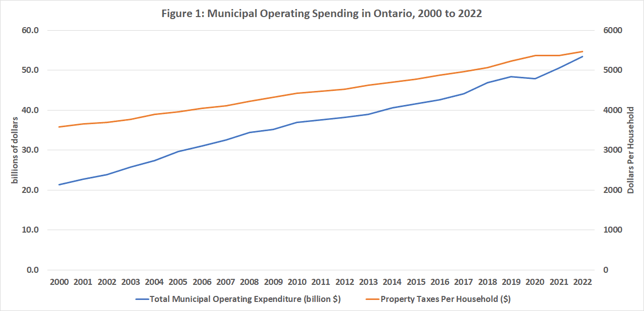
The first chart below plots total municipal expenditures along with average property taxes per household from 2000 to 2022. Since 2000, municipal operating expenditures have more than doubled going from $21.3 billion to $53.4 billion. It should be noted that total municipal operating spending has grown by 151 per cent while population has grown 61 per cent and the number of households by 134 per cent. Meanwhile, property taxes used to fund that spending have also grown from an average of $3,580 per household to $5,471 per household. Importantly, municipal operating expenditures do not include capital spending and much of that spending has been funded by debt. From 2000 to 2022, municipal net debt grew from $3.8 billion to $25.5 billion—nearly a six-fold increase in debt.

Figure 1

Over this period, the municipal workforce in Ontario grew from 216,367 to 234,235—an increase of 8.3 per cent over roughly 20 years. Much of the additional municipal spending is going into higher wages and salaries per employee rather than simply more employment. Indeed, any examination of the public-sector salary disclosure data for Ontario finds that the number reported earning more than $100,000 grew from 586 in 2000 to 61,021 in 2022 while the average salary for those over $100,000 rose from $118,333 to $127,294—an increase of eight per cent. While the average salary of those earning more than $100,000 has increased modestly, the growing number of municipal workers earning those high salaries has been the big expenditure driver. Put another way, in 2000 approximately one-third of one per cent of municipal employees on Ontario earned $100,000 or more whereas in 2022, that percentage had grown to 26 per cent.

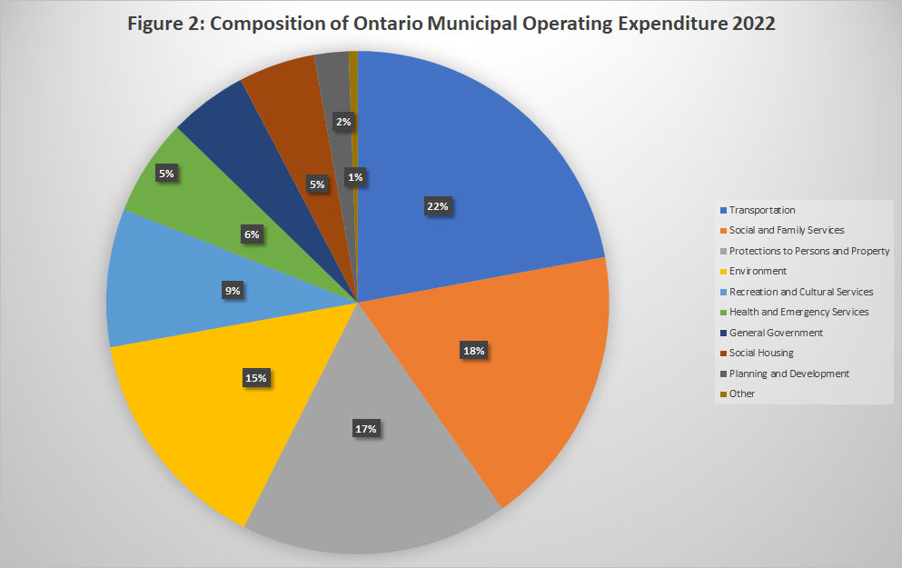
Where does the money go? The second chart shows the composition of municipal operating expenditures in 2022—the four largest expenditure items were transportation (22 per cent), social and family services (18 per cent), protection to persons and property (17 per cent) and environment (15 per cent). These four items together accounted for more than 70 per cent of municipal operating expenditures. What’s more interesting is the growth rates of all these categories since 2000 especially when compared to the growth rate of economic indicators.

Figure 2

Municipal operating expenditures since 2000 have grown the most in the categories of health and emergency services (335 per cent) followed by planning and development (215 per cent), then transportation and “Other” categories at 207 and 208 per cent respectively. Of the 11 expenditure categories, nine have grown faster than either nominal provincial GDP, real GDP, population or inflation (see third chart below). General government and social and family services have grown the least at 45 and 79 per cent respectively. While the relative restraint with respect to general government is welcome, the slower growth of social and family services given the social problems afflicting many Ontario cities seems a curious choice of priorities.

Figure 3

So, pulling everything together, here’s the story that emerges. Municipal operating expenditures in Ontario over the period 2000 to 2022 have grown 2.5 times faster than general inflation and double that of population. They have also grown a bit faster than the province’s output.

The increase in spending is driven by spending on wages and salaries but not in the manner one might think. Average salaries in the municipal sector for those making more than $100,000 annually since 2000 have grown by only 8 per cent but the number of individuals making those salaries has grown in the thousands of per cent. Within the broader public sector, in 2000 municipal employees accounted for 6 per cent of individuals on the salary disclosure list whereas by 2022 they accounted for 23 per cent.

In Ontario, municipal tax dollars have gone not so much into an expansion of services but into paying substantially more for roughly the same total number of people providing those services. And the areas of greatest spending increase have been in health and emergency services and planning and development. While the former can be explained by the pandemic and the opioid crisis, one must wonder where the value for money is with respect to planning and development given shortages of affordable housing and homelessness that have been allowed to develop across Ontario’s municipalities over the long term.

Tuesday 16 April 2024

What New “Affordable” Housing Looks Like in Thunder Bay

 As the federal government ramps up the billions to address the housing crisis in Canada including $6 billion to construct housing infrastructure. $1.5 billion to protect existing apartment buildings and a $15 billion apartment loan program, one would expect to see progress on the affordable housing front.  In the end, the issue is not really a shortage of housing to either buy or rent but affordable housing.  A glance at assorted real estate site in any city shows a large number of listings either for sale or for rent.  However, when one looks at the price, it is the cost of renting or buying that stands out, not a dearth of listings.

An illustration can be made for Thunder Bay which is seeing a large number of new rental building under construction.  A glance at Rent Panda reveals that some recent building projects are renting for some pretty hefty prices.  Take for example the two north side rentals in Thunder Bay shown below  – 80 Junot which is essentially adjacent to the Picton Street area and across from an EMS station – and 312 Crossbow – which is in a prime north side neighbourhood.  Location aside, both of these new build rental units are two bedrooms and two baths and rent for $2450 and $2400 a month respectively – utilities not included.  Two people earning minimum wage together could expect to earn at best close to $60,000 a year.  The rent alone will take up nearly half of their gross income, never mind the utilities.


Perhaps, south side rents are less?  Well the accompanying slide shows that a new build two bedroom one bath on Mary Street near Neebing Avenue is going for $2,300 a month though it includes water as a utility but likely not hydro.  I guess we could argue that these are all new builds and maybe we should settle for something older.  Well, a three bedroom one bath house on East Christina Street on the south side is renting for $2400 a month.  


The point here is that there is housing available for rent and some of it is new and quite nice but at $2300 and upwards a month and often excluding utilities, it is not affordable housing given the average incomes in Thunder Bay.  Median household income in Thunder Bay is just shy of $80,000 a year which means that half of households earn less than this.  At these rental prices, these below median income households will see close to half of their household income go to rent and utilities.  This is not affordable housing.  This is not geared to income or social housing.  This is where the shortage lies not only in Thunder Bay but across the country.


Monday 1 April 2024

Ontario’s Evolving Salary Disclosure List


Just before the arrival of the Easter weekend, Ontario released its annual public sector salary disclosure list.  The 2023 edition of the list saw a total of just over 300,000 individuals on the list earning a total salary amount of $38.2 billion for an average salary of $126,941.  What is interesting is looking at the long-term evolution of the list from its debut under the Harris government in 1996 to the present.  The list was instituted during Premier Harris’s Common-Sense revolution as a mechanism to essentially provide accountability for public sector salaries and spending and hopefully restrain their future growth.  Any public sector worker with a salary of $100,000 or more is on the list and that nominal salary bar has been the same since 1996. If the salary threshold has been adjusted for inflation using the CPI since 1996 – the all-Item CPI has increased by about 85 percent since 1996 – the threshold today would be about $185,000.


Figure 1 presents the total number of employees on the Ontario public sector disclosure list at five key points: the debut under Premier Mike Harris in 1996, the total at the end of the Eves era (which could really be called the Harris-Eves era given Eves was only premier over the 2002 to 2003 period), the end of the McGuinty premiership in 2013, the end of the Wynne era in 2018 and the current release for 2023 at the end of just over half a decade of Premier Ford. Figure 2 presents the total salaries earned by those on the list at the same points in time as Figure 1. 


In the first release of the list in 19967, there 4,501 public sector workers on the list earning a total of 546.8 million dollars for an average salary of $121,495.  By the end of the Common-Sense Revolution era, the number of employees on the list and total earnings had nearly quadrupled at 20,368 employees and $2.6 billion respectively.  After the tenure of Premier McGuinty a decade later in 2013, the number of list members had grown to nearly 98,000 for a salary total of $12.5 billion.  Between the departure of Premier McGuinty and the departure of Premier Wynne, the list grew yet again to reach just over 151,000 employees and $19.3 billion in salary spending. Since the end of the Wynne premiership, the number of employees on the list has nearly doubled to just over 300,000 and an accompanying  total salary bill of $38.1 billion.  


The growth in the public sector wage bill at least as represented by the public sector disclosure list has been driven more by quantity than by price.  In 1996, the average salary earned by those on the list was $121,495 whereas by 2023, that average had grown to only to only $126,941 – a nominal increase of under 5 percent and well below the overall rate of price increase.  Essentially, $100,000 today has about half the purchasing power in had in 1996.  The number of people on the list, however, grew from approximately 4500 to just over 300,000.  It may be time to look at updating this metric to consider both changes in the overall size of broader public sector employment as well as the effects of inflation on thresholds if one is to draw meaningful comparisons.